At my work place, my co worker had made a sign to indicate to people where to get their drinks if they didn’t hear us call them out. This was at the beginning of my last year in college, and I hadn’t used Illustrator in a while, so I wanted to get some practice in. I asked my manager if I could redesign the poster, and she gave me the go-head.
Since the blue didn't make a lot of sense to me, I first went with making the poster predominantly brown and white (like coffee:)) Next I wanted to include some motion to the poster, so instead of just a normal coffee cup just sitting still, I drew one that had gone flying/spilling every where. I made sure to add some dimension by adding gradients and shadows.
For the text, I went for a simple, friendly font that’s easy to read. I felt that stacking them more like stairs was a bit more visually interesting than them all being the same alignment. From the previous poster, I wanted to include the coffee bean, but putting it on the counter felt a little basic. So I troubleshooted and decided to replace the “I” in drinks with a coffee bean, and I felt like it added a bit of fun to the text.
For the background, I was originally going to keep it simple, but wondered if adding some sort of texture could give it some visual flair. My work has a lot of exposed brick walls, so I made a low opacity brick background in reference to that.
Overall, I did this poster redesign in one sitting (which took a couple hours), and I sent it over to my manager. Currently, this is what the poster looks like in the store today.
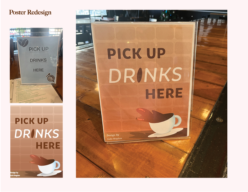
Image spread of old poster, flat artwork of redesign, and what it looks like in the cafe.