MISHKA MAGAZINE was a self driven project I did during winter break of my last year in college. The previous semester, we had a months long project where we had to create an entire brand including; a brand standards guideline, some required deliverables (stationary), and some additional deliverables (storefront, advertising, etc.). I learned a lot from that project and wanted to test what I had learned on to a new, slightly more simple brand idea.
MISHKA in my mind is an androgynous street clothing store, that should apply to anyone of any gender. I took what I know about color, typography, logo design, and branding to build the MISHKA brand from scratch. The simple color pallet I chose (red, white, and black) were chosen to give it that androgynous feel (white and black), while also adding a bold color often associated with street style (i.e. red). The logo was inspired by other logos for street fashion inspired brands (most of them are sort of blocky with all caps and a san serif font). Once I had the logo done, building the brand standards guide was pretty simple. It was a nice change of pace to focus on a design that was less feminine and minimalist.
Finally for the additional deliverables, that was where some of the challenges began. For the storefront, I took a picture of the outside of a street clothing store in the mall, and then I photoshopped their logo out and photoshopped mine in, and once I got the hang of editing it, I was really happy with how it turned out. Next was a very standard stationary set, just following the same design conventions as the brand. Finally, I wanted to try my hand at least one digital ad, so I found a very dynamic picture I liked and build an add similar to what you’d see from sports brand. I really liked this add because the blue helps brake up all the red.
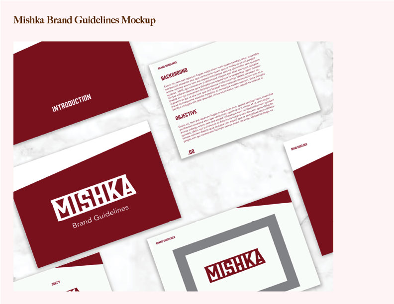
Mockup of what the brand guidelines pages would look like physically; includes cover page, intro page, background/objective page, and logo mockup page.
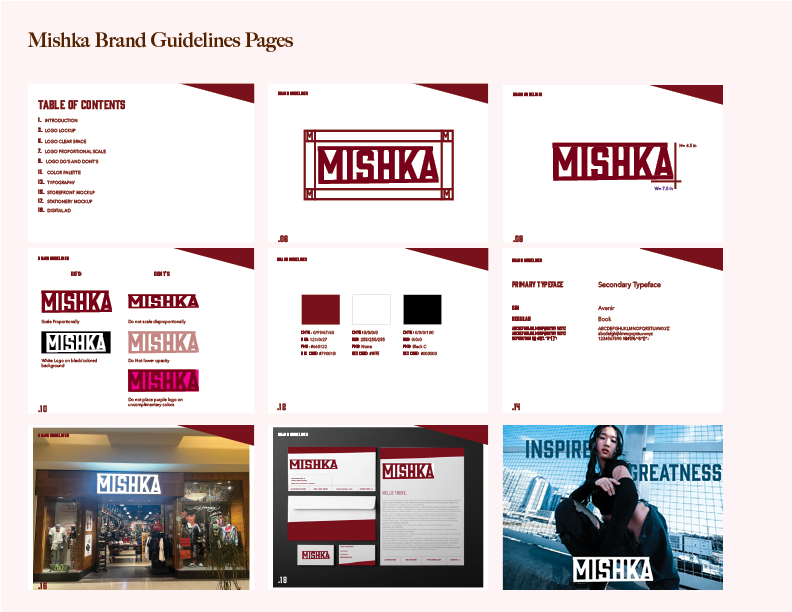
Image spread of all the guideline pages.