My last project at the end of last year was to design a movie poster, where the main goal was balanced hierarchy of text and information. I decided to go with a simple poster design with a lot of white space, that way the hierarchy would stick out more. The theme of the movie was feminist body horror/murder mystery with a dash of cults.
I had a friend take a picture of me with actual roses in my mouth. Then I took the image into photoshop, added a clipping mask/gradient of a spooky forest, turned down the the saturation of everything accept the roses, edited the roses to give them a slightly more pinkish color, and then I was satisfied.
Once the photoshop part was done, I took it into InDesign, since I find laying out text in InDesign is a lot easier than in Photoshop. I eyedropper tooled the color from the roses, so then the text would match. Another requirement for the assignment was we had to include our name a one of the lead actors. We also had to include the standard copyright next on every movie poster. This project was actually really fun and simple to do, and I still really like how it turned out.
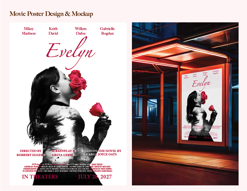
Movie poster design and mockup of what it would look like physically.